Second project! I am really looking forward to doing this. I guess that is because I love advertising.
The product that’s going to be on my project is Haagen-dazs ice cream. The first reason is that I love Haagen-dazs! The second reason is that it is summer now. Ice cream really represents the summer.
I make this list when I am brainstorming. The first one is too simple. I like simple things but it might not give the feelings I want.
Plus I can’t find only one thing that represents summer.
Second one is good, I want to combine it with the epidemic. Also, that emphasizes the good feelings we have when we have snacks (from the survey results)
Third one is good, but I am afraid of having the same idea as others. Besides, the survey result shows that people (at least my interviewees) care less about calories when they have snacks.
So I finally decide to use second idea.

The first draft here. The main idea is that you need to openup your fridge to get your ice cream, and when you have the ice cream, haagen-dazs can give you the feeling of summer even in the quarantine during the epidamic. I find a good picture of opening fridge and cut everything inside the fridge. I fill it with a picture of beach and palm trees (because in my opinion beach also represents summer). On the bottom I put a haagen-dazs package and copywriting. But after the crtique, I figure out that I should make some changes.

I upgrade the image inside the fridge. Put a small pack of Haagen-Dazs ice cream, and I use drop shadow to create the shadow for it so it looks more realistic. I put blur filter on them as well because it also makes the picture more realistic. I will tell you later why I put ice cream on that weird spot
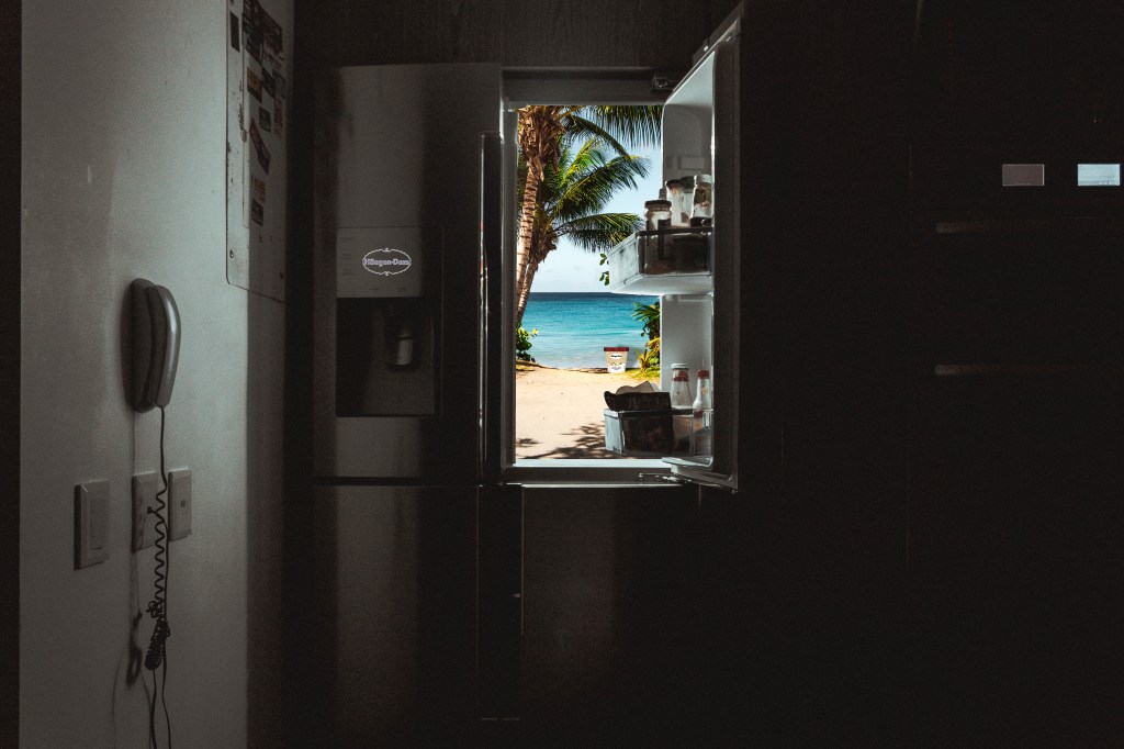
I cut everything inside the fridge, I still keep those things on the fridge door because that’s a fridge, it will makes it more realistic, again. I also use spot healing tool to get rid of the numbers on the panel of the fridge door. I was planning to put a Haagen-Dazs logo on the panel as you see, I even used neon filter to make it looks like it’s on the panel.

And as you see, the reason why I put my ice cream over there is that when the picture was put inside the fridge, it follows the golden spiral rule.
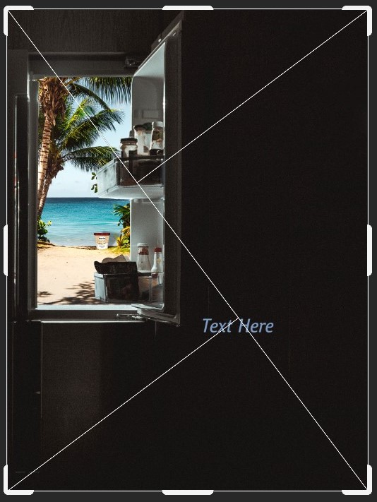
After that I want to edit the entire composition of the ad. I was gonna use rule of third, but I feel like I need to take a risk, and I want to make it more unique, so I use triangle rule instead
For the copy, I use:
“Enjoy Your Haagen-Dazs; Enjoy Your Scoop of Summer”
The word scoop can make audience associate with ice cream. Also, I deleted the phrase because it will make the copy too long and it sounds like a refrigerator ad.
I also put the logo on the right top of the ad. It has a lot of empty space and I want to use it without breaking the triangle rule
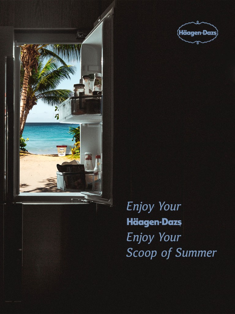
The font is sans-serif, it gives the feeling of friendliness. I change it to italic so it can contrast with the Haagen Dazs font. Color is baby blue because it is the color of sky and ocean. Personally I believe it can give audience a cool and calm feeling in hot summer. Logo and Haagen Dazs font are png files from the internet I also change the color from white to baby blue.
Here we go. The final version in iPad frame:

