Work-in-Progress: Project 1

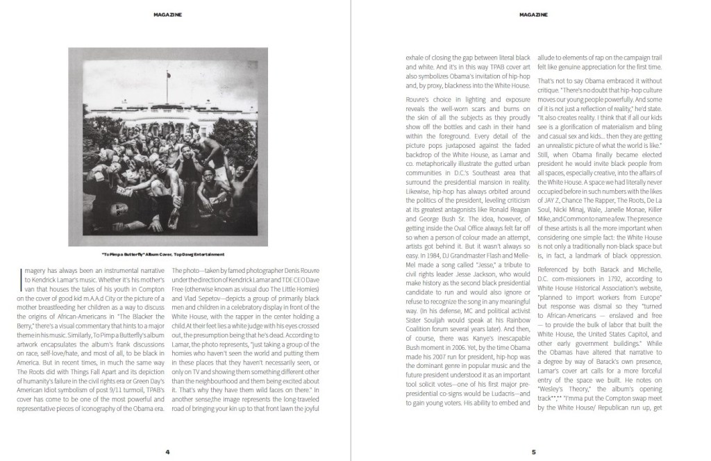
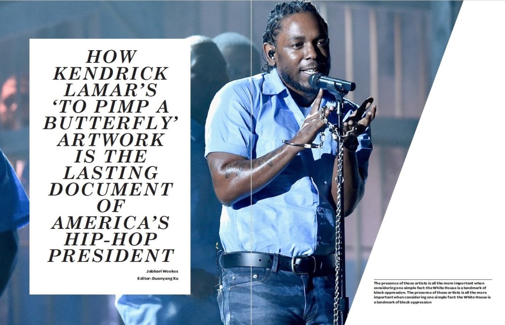
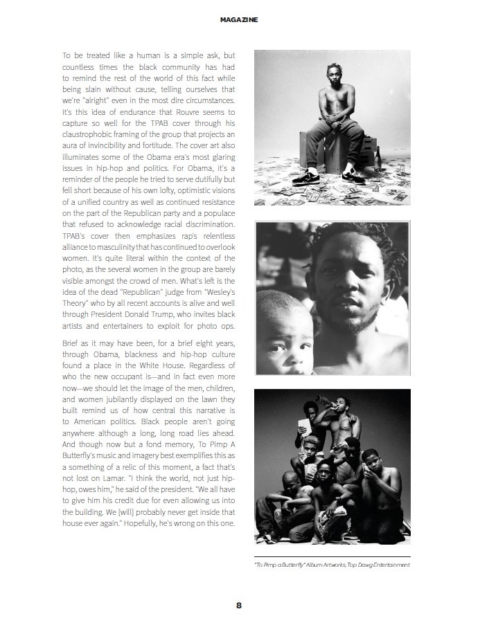
The very first project in cm323: lyrical posters in Adobe Illustrator.

I choose the song “Good News” by Mac Miller. This is Miller’s first posthumous release since his death in September 2018.

Mac Miller was one of my favorite Hip-Hop artists. He was super talented! I hope more and more people get to know him and his works.

Good News” is also one of my favorite song released in 2020. It is sad but beautiful. The song reveals his thoughts and feelings of him before his death.

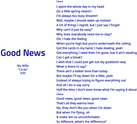
For the first layout, I plan to make it as simple as possible. I stick to my first instict to find different fonts and how they are put inside the layout. I also choose the color of navy because it corresponds to the main tone of the song (navy = blue, and blue = somber & sad).

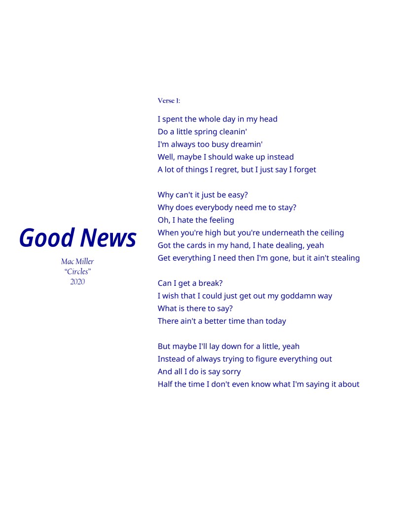
But I realize (and thanks to my teammates and TA help point it out) that first of all, the lyrics are too long and I should cut out the chorus part. Also, I am not 100% satisfied with the fonts. So I make these small changes. The final version looks like this:

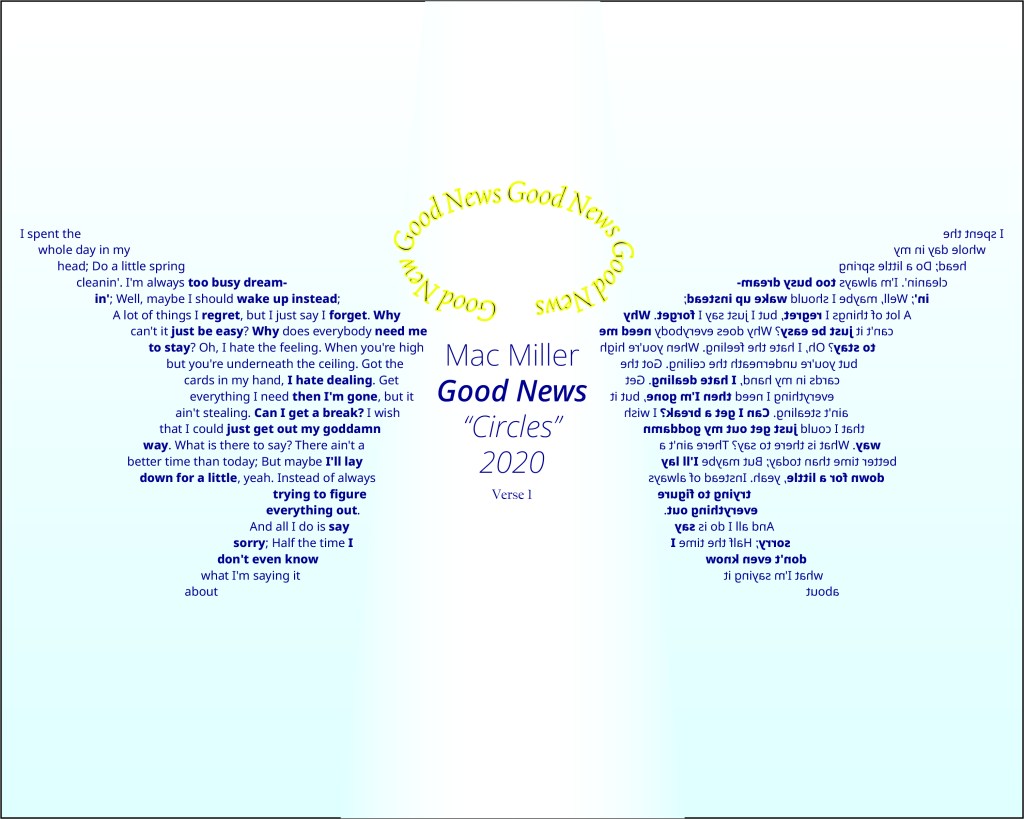
For the second layout, we suppose to be bold: break some rules so that we can best express the ideas of the song we choose.

The first idea I have is “angel”. Mac Miller is an angel now.

Therefore, I come up with the image of an angle, and thus the wings and the halo.

I draw a wing, copy & paste, and reflect it so I have two identical wings. I fill in the wing with the lyrics.

For the halo, I put the song title and make it as a halo. I also use the color of yellow on stroke and navy inside.

Thanks to my classmates and Professor K, I make small changes: I add gredient on the background to make it look like a sky. I just simply copy & paste and reflect the wing so they look exactly the same.

The final verison looks like this (it’s sad that I delete the first draft):

This is my very first design work! I hope I can do a good job on project 2.

And rip Mac Miller.

Work-in-Progress: Project 2

Second project! I am really looking forward to doing this. I guess that is because I love advertising.

The product that’s going to be on my project is Haagen-dazs ice cream. The first reason is that I love Haagen-dazs! The second reason is that it is summer now. Ice cream really represents the summer.

I make this list when I am brainstorming. The first one is too simple. I like simple things but it might not give the feelings I want.

Plus I can’t find only one thing that represents summer. 

Second one is good, I want to combine it with the epidemic. Also, that emphasizes the good feelings we have when we have snacks (from the survey results)

Third one is good, but I am afraid of having the same idea as others.  Besides, the survey result shows that people (at least my interviewees) care less about calories when they have snacks.

So I finally decide to use second idea.

The first draft here. The main idea is that you need to openup your fridge to get your ice cream, and when you have the ice cream, haagen-dazs can give you the feeling of summer even in the quarantine during the epidamic. I find a good picture of opening fridge and cut everything inside the fridge. I fill it with a picture of beach and palm trees (because in my opinion beach also represents summer). On the bottom I put a haagen-dazs package and copywriting. But after the crtique, I figure out that I should make some changes.

I upgrade the image inside the fridge. Put a small pack of Haagen-Dazs ice cream, and I use drop shadow to create the shadow for it so it looks more realistic. I put blur filter on them as well because it also makes the picture more realistic. I will tell you later why I put ice cream on that weird spot

I cut everything inside the fridge, I still keep those things on the fridge door because that’s a fridge, it will makes it more realistic, again. I also use spot healing tool to get rid of the numbers on the panel of the fridge door. I was planning to put a Haagen-Dazs logo on the panel as you see, I even used neon filter to make it looks like it’s on the panel. 

And as you see, the reason why I put my ice cream over there is that when the picture was put inside the fridge, it follows the golden spiral rule.

After that I want to edit the entire composition of the ad. I was gonna use rule of third, but I feel like I need to take a risk, and I want to make it more unique, so I use triangle rule instead

For the copy, I use:

“Enjoy Your Haagen-Dazs; Enjoy Your Scoop of Summer”

The word scoop can make audience associate with ice cream. Also, I deleted the phrase because it will make the copy too long and it sounds like a refrigerator ad.

I also put the logo on the right top of the ad. It has a lot of empty space and I want to use it without breaking the triangle rule

The font is sans-serif, it gives the feeling of friendliness. I change it to italic so it can contrast with the Haagen Dazs font. Color is baby blue because it is the color of sky and ocean. Personally I believe it can give audience a cool and calm feeling in hot summer. Logo and Haagen Dazs font are png files from the internet I also change the color from white to baby blue.

Here we go. The final version in iPad frame:

Work-in-Progress: Project 3

Project 3 is going to be on Indesign! This is the only software I have used before the class. I used to use it to edit the newspaper for my media club in high school. I am pretty fimiliar with it.

For this project, we need to find an article related to graphic design I choose an article that discusses how the cover design has the deep and profound meanings. I feel that it is something that you can think of if you like music. The album is called “to pimp a butterfly”, it is made by Kendrick Lamar, one of my favorite artists. The album is literally one of the best albums in the 2010s. And this article tells you why it is not only an outstanding album but also a visual masterpiece.

The first draft is here. I still make changes after I finish it although I missed the critique.

For the first draft, I didn’t put any cover. Just straight body text. But I find out that the template is actually good. So I just use it and keep it without making any changes. I use the photo of Kendrick Lamar performing on the Grammy. I believe this was 2016’s Grammy and the songs he performed were from the same album this article talks about. So I use it. It took me sometime to find a good large photo that really suitable for the template. I changed the font of the title because the original one wasn’t really suitable for this article. I use serif to create a sense of solemnity. The right side is the intro of the article. It follows the template.

The next page. I use the drop cap here. The font follows the template. I try my best to get rid of the rivers but it doesn’t work well enough. Over here is the album cover of “To pimp a butterfly”, and I find a quote from the article that describes this cover. High light the keywords. These are aligned toward spine, right at the left side of the picture. On the right side, I put the picture on the top is just because it will be different from the left side. I leave whites so it will not be so crowded.

Next page, I make some differences because I dont want to be text heavy. It is visually tiring. Two pictures from the album. And I put the descriptions below. These texts are from the website called genius. I paraphrase them and put them over here so the audience can know more about the art design of this album. On the right page, I put a photo of President Obama and Kendrick Lamar is because this part of article associates with Obama. I make the image larger than the previous page because this part of text has fewer words, and also after doing that, it will be different and still follow the entire design. 

The last page, I still keep the template, two colomn, I make a text wrap so the text will be all on the left side and the pictures are on the right side. I use “wrap around bounding box” because it will be messy. These pictures are album artworks from “to pimp a butterfly” that can help audience know better about the album.

That’s it for the project 3. I am really exciting for the project 4! I love group project.

Sketchbook Vol.1

Personal Design Taste:

Simple

Even though the word “design” is associated with “complicated”, the best design for me should be simple. I like ads/posters/covers that are simple: using only a couple of elements to express the main themes/ideas/concepts and catch audiences’ eyes simultaneously. Although having more elements might help designers voice their thoughts and ideas, those elements might not have good visual chemistry. Therefore, the entire design work will be messy. In the design world, I believe, “less” is always “more”.

Different

We are in a digital era, where we will encounter hundreds of thousands of pieces of information every day. Those include innumerable “design” works. So, if you want your design piece to be remembered, you should be different from others. Thus, your audience can notice your works. But “be different” does not mean “be wired”: I will not take a look at design works that are “wired” in my opinion.

Good use of colors

Color is one of the most important elements in a piece of design. A designer can easily use color to achieve his/her objects. But for me, you should use different colors/color patterns in various cases and scenarios: sometimes black & white works well, while sometimes the more colors you use, the better visual effects you will have (but it really depends on the concept behind the design work). Also, you should try and match different colors in your design works. Some color matches are perfect; some are ugly and awful.

Favorite Design Works

I really like music, especially hip-hop and rap. So these are hip-hop album cover designs that I love. Sometimes they will give me inspirations.

“4:44” Jay-Z
“Swimming” Mac Miller
“IGOR” Tyler, the Creator
“Channel Orange” Frank Ocean
“Malibu” Anderson .Paak
“Kids See Ghost” Kids See Ghost (Kid Cudi & Kanye West)
“FM!” Vince Staples
“Alfredo” Freddie Gibbs & The Alchemist

Sketchbook Vol.2

Color & Design

As I said before, color is one of the most important elements in a piece of design. Color can help the designer to shape the feelings coming from the audiences when they encounter with the design work. Color can also help express the main idea(s) of a piece of design. Even simple black and white are useful and helpful.

Famous Nike ad. Black & White color give the ad a feeling of solemnity, which is correspond to the main idea of the ad.

For me, “color” in a design piece means much more than “what it looks like”. It is definitely a useful approach that designers can use to put their thoughts and ideas in their design works. In my design process, I will think of “color” when I construct the blueprint in my head: what kinds of colors/color palettes am I going to use?

Is it possible to appreciate design with limited or no sight?

To answer this question, we should first make it more detailed:

If your audience can only use their eyes to see it (for example: TV & billboard ads, and posters), then limited sight will harm the process of your audience appreciating your design works. If there is no sight, there is no way your audience can react to your design works. It is impossible for them to appreciate design.

If you audience can use all sense perceptions to “feel” the design (for example, clothes and shoes, things you can feel it), then “sight” is not the only method they can utilize. Therefore, limited sight or no sight will not stop your audience appreciating your design works because they can use other senses. From textures to smells, designers can use various approaches to make their design works more accessible.

Sketchbook Vol.3

The Purposes of Advertisement

Selling/Profiting/Gaining Popularities

The most realistic answer is “selling a product and generating profits from it”. It is the reason why companies hire hundreds of people and spend millions of dollars to make 15-second short films or a big poster. Advertisements can help companies to gain popularity, attract customers, and make money by selling products/services in the ad.

Educating Audience

From the “See Something, Say Something” ads in subway stations to “go vote” ads, you can see every election year, these ads are made for educational purpose. Governments, institutions, and individuals want to use advertising as a mass communicational method to educate its audience and call upon their actions.

Spreading Loves

When the tragedy of George Floyd happened, lots of people shared information about charities on their social media accounts. This can also be considered as “advertising”. But the purpose of this type of ad is to spread love and appeal for changes (on social injustice). Similar things happen in China when natural, or man-made disasters occur: people tend to share useful information on Weibo and WeChat (Chinese Version of Twitter and What’s App). They hope it will help people who need it.

Is it possible to have “good” advertising? “Bad” advertising? Why, and what is the difference?

Yes.

First of all, we can judge the advertising by evaluating its outcome: does it achieve particular objectives? If it doesn’t. We can definitely put the “bad” label on that piece of advertising.

We can also take a look at the impact/influence the advertising has. If the ad ends up receiving massive backlash, it is easy to tell that it is a “bad” ad. If everyone remembers the ad itself and the brand/company/individual behind it, it is safe to say that it is “good”.

Additionally, in my opinion, the advertising that has too many exaggerations are “bad”. I understand that sometimes you need to exaggerate something in your ad to have specific effects or to achieve particular objects. But too many exaggerations are not helpful at all as they distort the facts. The ad, therefore, is more of a type of fraud.

Sketchbook Vol.4

Visual Element in China: Lantern

When we think of China, the first several words we come up with definitely include “lantern”. The lantern has become one of many representatives of China. When you see some lanterns hanging beside a Chinese archway, you can tell that you are in the Chinatown.

Some video games and movies also include lanterns as they portray Chinatown or Chinese. When we see lanterns, we can tell that we are in the Chinatown/China.

Call of Duty: Modern Warfare

However, lanterns are also one of the most misused visual elements of China. Why? Because we only hang lanterns on the streets during the Spring Festival. You can only see lanterns around the Spring Festival and the Lantern Festival every year, and for the rest of 11 months, you cannot find lanterns on the streets. Similar to the Christmas tree, the lantern is a type of decoration that we use only for the Lunar New Year. Sometimes, it will be misused to represent China/Chinatown.

But at the end of the day, I am still happy because, as a Chinese, I would like to see that more people are using Chinese visual elements and understanding Chinese cultures. It makes me proud as a Chinese.

Sketchbook Vol.5

Photo Manipulation

Photo manipulation seems a bit normal to me. Lots of my friends would like to use photoshop and all kinds of filters when they take pictures. I use it sometimes. Obviously, the reason behind it is to make the images look better. We tend to use tools to get rid of those “flaws” on photos.

Suppose you want to use photo manipulation tools to make your photos look better. In that case, you can definitely do it because it is your photo, and you have the right to handle it with whatever you want.

“Ethical” Photo Manipulation

As far as photo manipulation is done by the individual who owns the photo, and it is for an individual’s own interests (make it look better, hide private information), the photo manipulation can be considered as ethical. Otherwise, photo manipulation is not really ethical. In fact, lots of people use this approach to deceive others or generate profits. Some even manipulate photos from others without permission. They are all unethical.

What is the purpose of the human image in advertising? What is the purpose in news? Is there a difference?

The purpose of the human image in the news is simple: expressing the truth. All human images are used to tell their audiences what is happening and what the story is about. They are a massive part of the story.

The purposes of the human image in advertising are complicated. Sometimes it is used for celebrity endorsement; sometimes, it is used for reflecting certain aspects of the product/service.

Speaking of photo manipulation, in the news, television workers manipulate human images to protect privacy. While in the ad, photo manipulation is often used for exaggeration.

Sketchbook Vol.6

Misleading Design

I have seen some misleading tactics that are used by designers. They are mainly used for displaying statistics. Designers use them to create false appearances on specific facts and therefore achieve their objectives. In this process, they do not change any data. The only thing they do is to change how the data is shown.

This is the compilation of real-life examples. These designers have done good jobs, and to be honest, I have not noticed anything wrong in some cases.

Another misleading tactic that designers often use occurs in advertising. Ad designers tend to enlarge particular critical points on the ads to attract customers. But sometimes these key points are just partially correct. In this situation, designers will try to hide some information. This information will make the stats they emphasize less fascinating. Designers shrink the font sizes and put them in a place where customers cannot easily notice (Sadly, I cannot find any ads to explain it).

Sketchbook Vol.7

Typefaces: Serif vs. Sans-Serif

For me, “how those letters look like?” is always a question that I am considering when I do my design work. Before learning it, I know different typefaces look different and give various feelings to audiences. Even before this class, I will use different fonts in different situations.

Serif

This type of font gives me a feeling of solemnity and seriousness. I will use it in the body copy of my slides as it looks like the one from the real book. But I don’t use it a lot since “solemnity” is not my design style. The other reason might be that I think the word “book” is usually associated with “boring”.

Sans Serif

My first choice. This is the most common typeface in my design works. I like it because it is tight and neat. If you make it bold, bigger, and change another color, it will be striking and eye-catching. It meets most of my needs in my design process.

What about Italic?

I also use italic a lot in my design process when I quote from other sources. As you will notice on this page, I also use italic to separate different sections. I don’t really have the feeling of elegance from the italic. I use it because it is different, and my audience can directly notice it once they see my design works. It allows me to naturally separate different parts without inserting lots of white spaces.

Sans-Serif & Serif in Chinese

Similarly, there is also the system of “Serif” and “Sans-Serif” in Chinese.

Even though we don’t use the jargon “Serif” and “Sans-Serif” in China, we do use these two different typefaces in our daily lives. When you compare two different typefaces in China, you can find the difference, the same as the one between sans-serif and serif.

In traditional Chinese calligraphy, you can usually see serif typeface.

This style of calligraphy is called “Kaishu”. It is serif if you want to classify it.

In modern China, “Songti” is another common serif typeface that we usually use. Similar to other serif typefaces in English, “Songti” gives the feeling of solemnity as well. Therefore, we usually use this typeface in formal occasion.

Songti

“Weiruanyahei” is the most common sans-serif typeface we use.

Weiruanyahei. You can definitely tell that it is sans-serif.