Personal Design Taste:
Simple
Even though the word “design” is associated with “complicated”, the best design for me should be simple. I like ads/posters/covers that are simple: using only a couple of elements to express the main themes/ideas/concepts and catch audiences’ eyes simultaneously. Although having more elements might help designers voice their thoughts and ideas, those elements might not have good visual chemistry. Therefore, the entire design work will be messy. In the design world, I believe, “less” is always “more”.
Different
We are in a digital era, where we will encounter hundreds of thousands of pieces of information every day. Those include innumerable “design” works. So, if you want your design piece to be remembered, you should be different from others. Thus, your audience can notice your works. But “be different” does not mean “be wired”: I will not take a look at design works that are “wired” in my opinion.
Good use of colors
Color is one of the most important elements in a piece of design. A designer can easily use color to achieve his/her objects. But for me, you should use different colors/color patterns in various cases and scenarios: sometimes black & white works well, while sometimes the more colors you use, the better visual effects you will have (but it really depends on the concept behind the design work). Also, you should try and match different colors in your design works. Some color matches are perfect; some are ugly and awful.
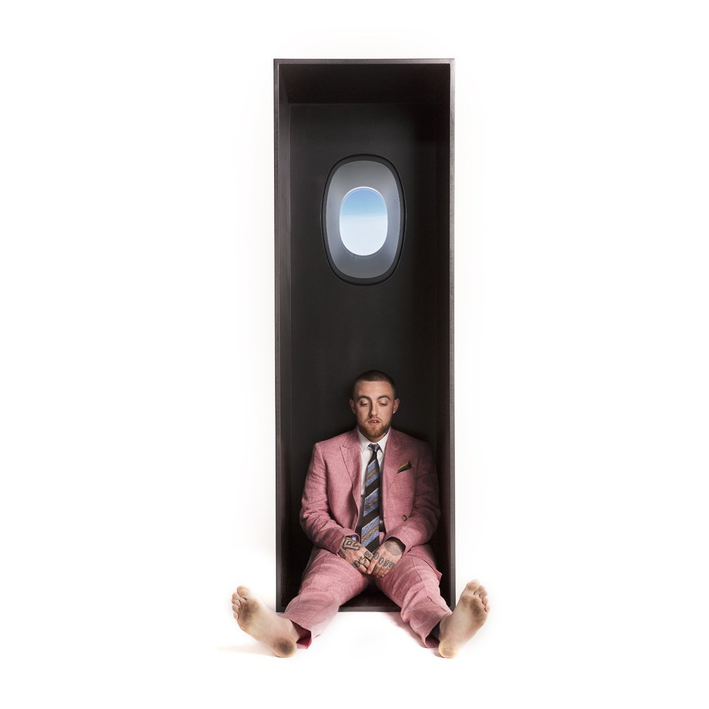
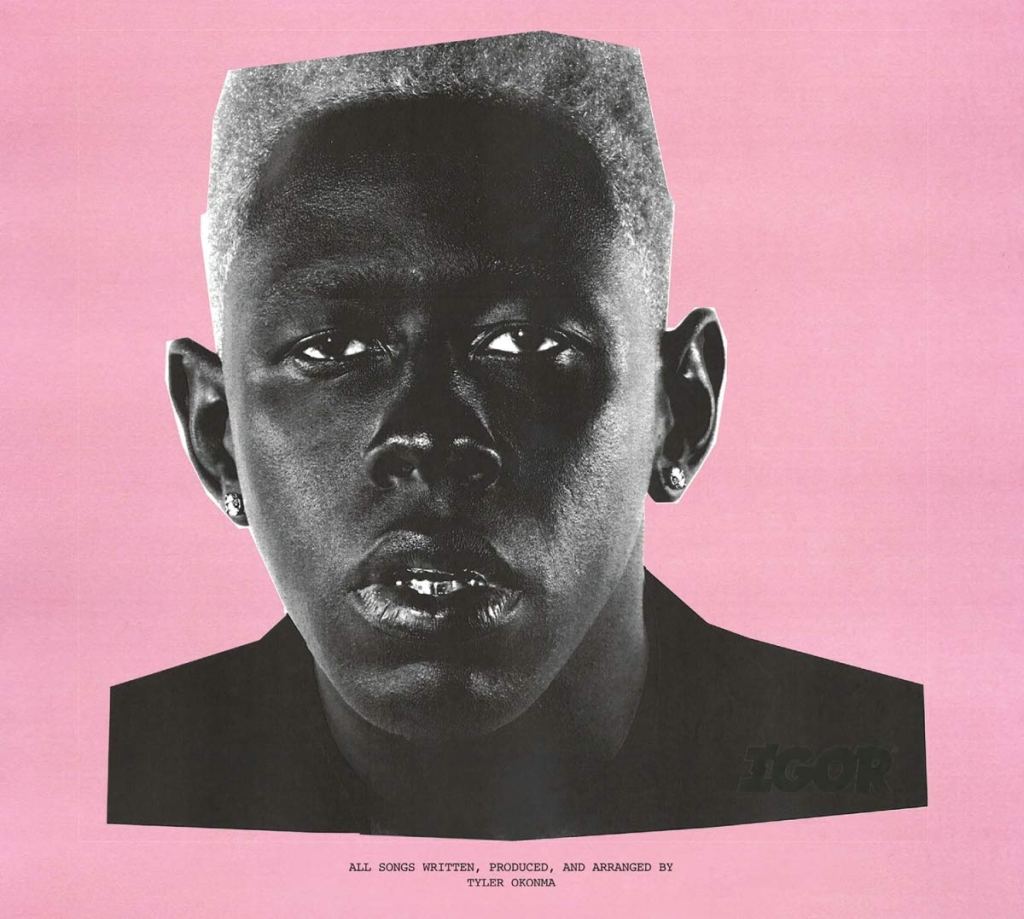
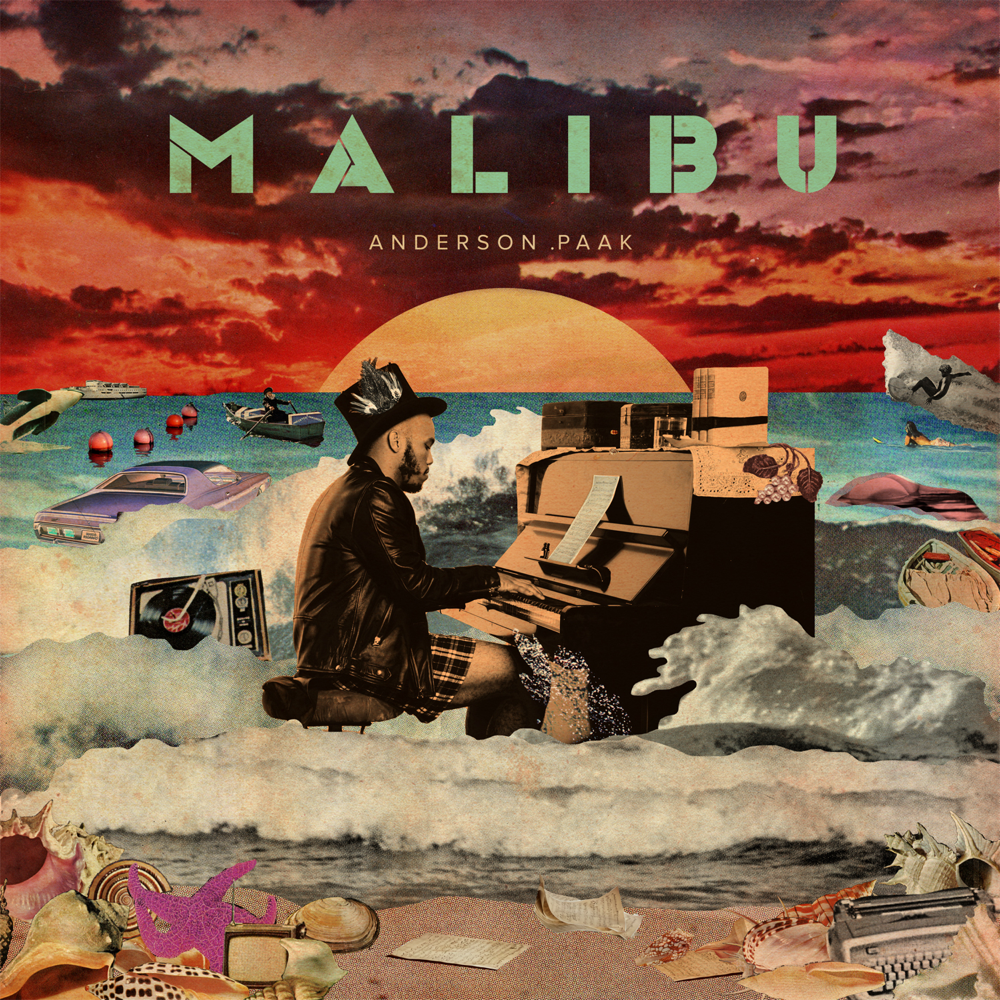
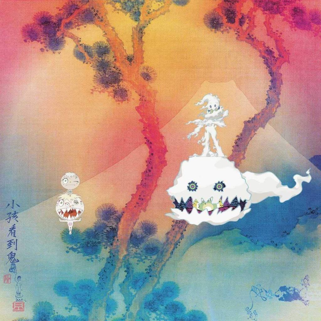
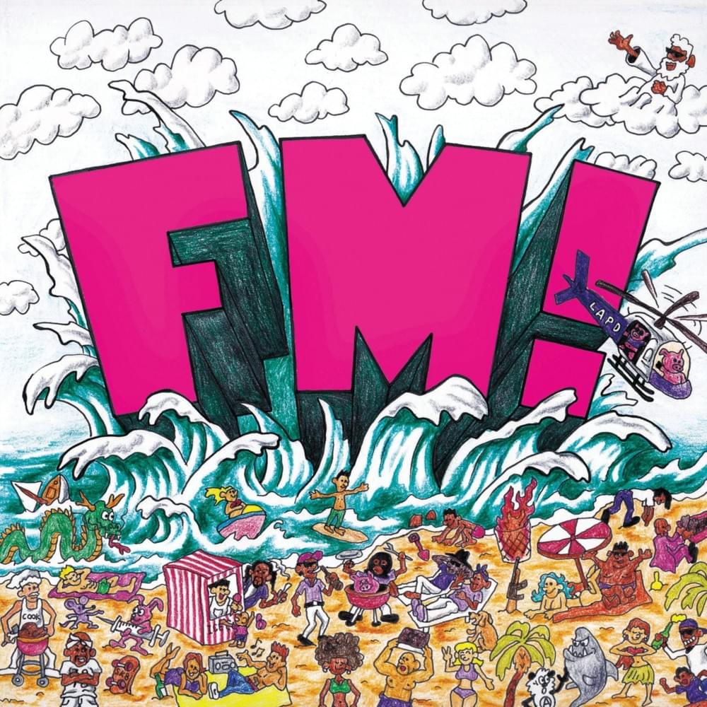
Favorite Design Works
I really like music, especially hip-hop and rap. So these are hip-hop album cover designs that I love. Sometimes they will give me inspirations.